
Turning Knowledge into Products

7 Onboarding Steps That Convert Creator App Trials

Foundry
May 29, 2026
Share
7 Onboarding Steps That Convert Creator App Trials

Get Creator Revenue Insights

How creators are turning audiences into subscription businesses
Share
Key Takeaways:
  • The global app onboarding completion rate after 30 days was 8.4% in Q2 2025, meaning more than 90% of installs never finish setup (Digia Engage, 2025)
  • 82% of trial starts happen the same day a user installs the app, so onboarding is the only chance to convert (RevenueCat State of Subscription Apps 2025)
  • Top decile (P90) apps hit a 20.3% trial start rate, more than 3x typical performers, almost entirely due to better onboarding
  • Across all consumer subscription categories, only 1.7% of downloads convert to paying subscribers without a tight onboarding flow
  • A creator app that opens with the creator's face, asks the right 3 questions, and delivers a quick win in the first session converts 2 to 3x better
Creator apps lose more users in the first 60 seconds than in any other moment of the customer journey. The difference between a creator app that prints recurring revenue and one that bleeds installs is almost never the product. It is the onboarding. Creator app onboarding is the first session experience from the moment a user opens the app to the moment they either start a trial, pay, or churn. For a subscription creator app, this is the highest-leverage surface in the entire product. Get it right and you compound. Get it wrong and your acquisition spend evaporates. The data is brutal. Adapty's 2025 report on in-app subscriptions found that across all consumer apps and regions, around 1.7% of downloads convert to paying subscribers (Adapty, 2025). The top 10% of apps convert at 3x that rate, and the gap is almost entirely created in the first 90 seconds. Here is the playbook that closes the gap.
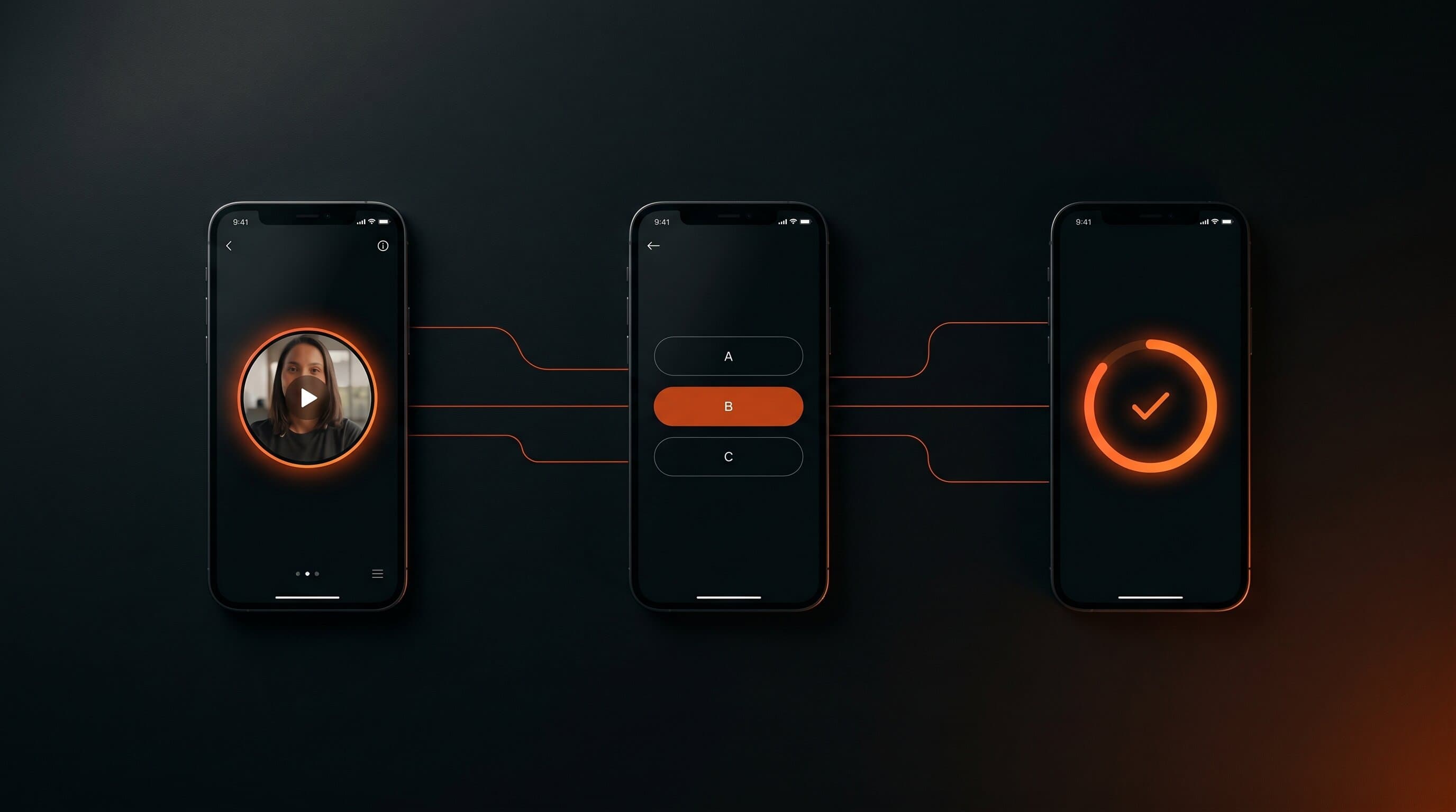
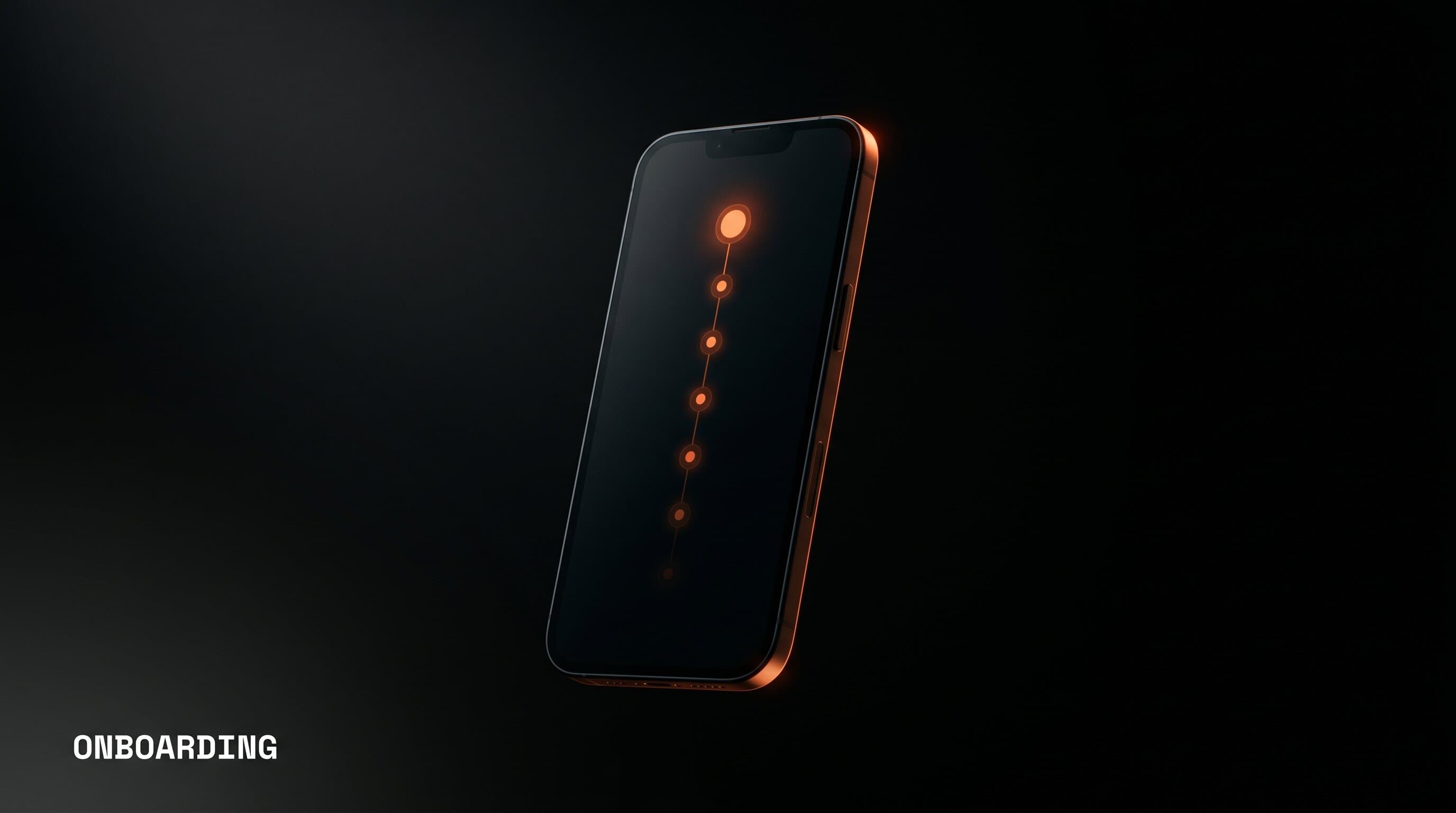
Creator app onboarding flow shown on a phone with progress glowing along a series of steps
A creator app is sold on trust. Users tap install because they trust the creator. The onboarding is the moment that trust either transfers to the product or evaporates. There is no second impression. RevenueCat's 2025 benchmark report notes that 82% of trial starts happen the same day a user installs the app, an even higher share than the prior year. In other words, the user is not coming back tomorrow to give your app another shot. The session you have right now is the session you get. That makes onboarding the single most important growth lever in a creator app. Bigger than the paywall. Bigger than push notifications. Bigger than pricing. Get those 90 seconds right and everything else compounds. The first screen of a creator app must feature the creator's face and voice. A logo splash, a generic welcome, a "let's get started" button with no human in sight is a wasted second of trust. The best executions use a 6 to 12 second video of the creator looking into the camera and explaining what the app is for. Caroline Girvan's CGX app opens with her on camera setting the tone. Pamela Reif's PAM app opens with her talking directly to the user about what the next 12 weeks will look like. Cassey Ho's Body by Blogilates opens with her energy intact, not a marketing voiceover. What works:
  • A short, vertical, captioned video clip of the creator
  • The creator's first name in the welcome text
  • A specific, outcome-focused promise: "I'll get you to a real handstand in 8 weeks," not "welcome to the app"
The trust the user has in the creator is the only asset onboarding has to spend. Spend it immediately. The next screen should be a quiz, not a sign-up form. A 3 to 5 question quiz that personalizes the app's recommendation does three things at once: it builds the user's sense that the result will be tailored to them, it generates segment data the app can use later, and it triggers the IKEA effect, where users value something more once they have invested effort in building it. The questions must feel like they shape the outcome, not like data collection. Compare:
Bad questionGood question
What is your email address?What is the one habit you want to build in the next 30 days?
What is your age?How much time can you commit per day: 5, 15, or 30 minutes?
What is your fitness level?When you finish a workout, do you want to feel energized, calm, or strong?
What goals are you interested in?Pick the result you want most: lose fat, build strength, or improve mobility
Three questions is the sweet spot. The Adapty 2025 report found that onboarding quizzes with 3 to 5 questions outperform both shorter and longer flows. Anything under 3 questions does not feel personalized. Anything over 5 feels like a tax. After the quiz, before any login or payment screen, show a single proof screen. This is where you show the user that other people like them have already done this and gotten the result they want. What goes on the proof screen:
  • A specific number: "Joined 14,200 women training with [Creator]"
  • One real user testimonial, not three
  • One before-and-after stat that matches the goal they just picked in step 2
  • One App Store rating with the actual star count
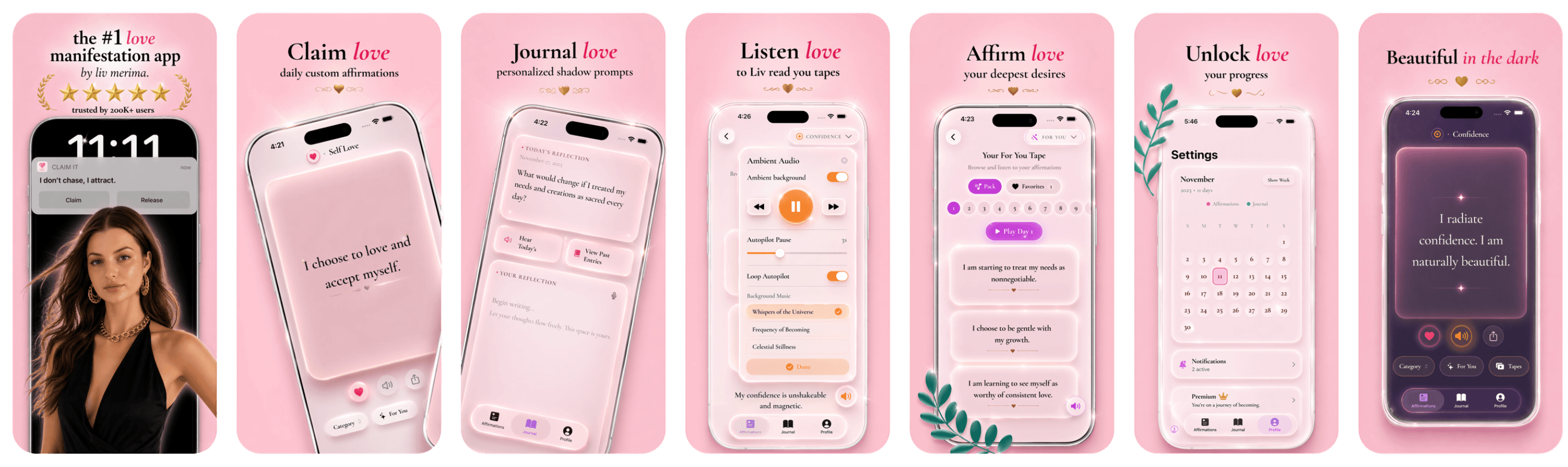
The proof screen is the cheapest 5 seconds of conversion lift you will ever build. It also primes the user to take the next step, which is the paywall. For more on the math behind that lift, see our breakdown of why most creator apps lose subscribers in the first 60 days. The user must finish the first session having experienced one tangible result, not having watched a tour of features. A quick win is a 2 to 4 minute experience that delivers value the user can feel, share, or measure. Examples that work for creator apps:
Creator app typeThe quick win in session 1
FitnessOne short, completable workout that leaves the user a little out of breath
MeditationOne 3 minute guided session, with a felt shift in breathing
Skill / educationOne actionable lesson that ends with the user shipping something tiny
Manifestation / mindsetOne written intention or affirmation saved to a daily list
Nutrition / cookingOne recipe or grocery list generated for the user's current week
The quick win is the moment the user becomes a believer. Without it, the trial is a countdown. With it, the trial is a habit forming. The paywall comes after the quick win, not before it. The user must feel the result first, then be asked to pay. This is the part most creator apps get exactly backwards. They show the paywall on the second screen, before the user has any reason to care. The data is unambiguous: gating the paywall behind a short, valuable onboarding flow lifts trial start rates by 2 to 3x. If you are still working out the basics of how paywalls function in subscription apps, read our explainer on how creator app paywalls actually work before you ship anything. For the deeper math on what to charge and how to structure the trial offer, our trial to paid conversion guide breaks down the five levers that matter most.
Phone showing a creator app paywall with annual and monthly options against a dark studio background
The paywall belongs on screen 5 or 6, not screen 2. Specifically, it goes immediately after the quick win, while the user is still feeling the result. The structure that converts:
ScreenWhat the user sees
1Creator video, outcome promise
23 question quiz
3Proof screen, specific number and rating
4Quick win in session, 2 to 4 minutes
5Personalized plan revealed, gated by the paywall
6Paywall, annual default, monthly as a small option
The paywall copy should reference the user's quiz answers. "Your 8 week strength plan is ready" beats "Subscribe to unlock content" every single time. Specificity is the entire game. Default to the annual plan, with a small monthly option below it. RevenueCat's data shows that defaulting to annual lifts lifetime revenue by 50 to 70% per user, because monthly subscribers churn 3 to 5x faster. A 7 day trial that shows "5 days left" on the home screen is a countdown to cancellation. A 7 day trial that shows "Day 2 of 7 in your plan, you have completed 1 workout, 3 to go this week" is a streak forming. The difference is everything. The first frames the trial as a window the user has to exploit before it closes. The second frames the trial as a relationship the user is in the middle of building. What progress looks like in a creator app trial:
  • A streak counter for daily actions
  • A visible plan or roadmap with completed and upcoming sessions
  • A growing portfolio of results, photos, journal entries, or completions
  • A small, visible push at the end of each session, "Tomorrow: chest and triceps"
Every one of those is a hook back into the app. The user is not waiting for the trial to end. The user is waiting for tomorrow. This is also where push notifications earn their keep, but they are not the main lever. The main lever is what the home screen does when the user opens the app on day 2. The single most valuable notification in the entire customer lifecycle is the day 2 welcome push. It is the one that decides whether the user comes back for session two, which is the strongest predictor of trial conversion in every subscription category. A few rules:
Push ruleWhy
Send at the same time as session 1The user has already shown they have time at that hour
Use the creator's name as the sender"Caroline" lands harder than "CGX App"
Reference the next session by name"Your day 2 mobility flow is ready" beats "Don't forget to train today"
Limit to one push per dayMore than one push trains the user to disable notifications, and you lose them forever
The day 2 push is also where you measure. If your day 2 open rate is below 25%, your onboarding is leaking before the trial even gets a chance to convert. If it is above 50%, you are in the top decile and your trial-to-paid will follow. For the long tail of how to keep those subscribers paying after the trial, our guide on creator app retention tactics that beat churn is the right next read. The total onboarding flow from app open to paywall view should take 90 to 180 seconds. The quick win, which is the most important part, should fit inside that window. Anything shorter feels rushed and the trust transfer does not happen. Anything longer and the drop-off curve gets steeper than the lift from personalization. The Q2 2025 onboarding completion benchmark of 8.4% comes almost entirely from apps that overengineered the flow. Three minutes. That is the budget. Spend it on the creator, the quiz, the proof, the win, and the paywall. In that order. Track these five. Anything else is noise:
MetricWhat it tells youTarget for a healthy creator app
Onboarding completion rateWhether your flow is too long or too pushyAbove 60% on session 1
Trial start rateWhether your paywall is positioned rightAbove 20% of installs
Day 2 retentionWhether your quick win actually landedAbove 40%
Trial-to-paid conversionWhether the product earns the recurring paymentAbove 30%
Annual plan opt-in rateWhether the paywall defaults are workingAbove 60% of paid subscribers
If you are tracking more than these five, you are letting analytics get in the way of building. If you are tracking fewer, you are flying blind. 90 to 180 seconds, with a 3 to 5 question quiz and a single quick-win interaction. Top decile subscription apps in the RevenueCat 2025 benchmark cluster in this range. After. Gating the paywall behind a personalized onboarding flow with a quick win lifts trial start rates by 2 to 3x compared to a paywall on launch. This is one of the most consistent findings in subscription app benchmarks. 3 to 5. Fewer feels generic. More feels like a survey. Each question should make the user feel the personalization will reflect their answer. For most creator apps, yes. Trials of 3 to 7 days outperform both no-trial and long-trial setups in conversion math, especially when paired with a clear push reminder before the trial ends. For a deeper breakdown, see our free trial vs paywall comparison for creator apps. Day 2 retention. If users come back on day 2, they convert. If they do not, no paywall copy in the world will save the trial. Build for day 2. The reason most creator apps lose 90% of users in onboarding is that the onboarding was designed for the creator, not the user. The user does not want a tour. The user wants the result they came for, in the first session, before the trial countdown starts feeling like work. Open with the creator. Ask 3 questions that shape the outcome. Show one piece of real proof. Deliver one quick win. Drop the paywall while the win is still warm. Make the trial feel like progress. Send the day 2 push that brings them back. That is the whole game. Everything else is decoration. Built by Foundry builds creator subscription apps with this exact onboarding architecture baked in from day one. We design, ship, and continuously optimize the flow so trial-to-paid conversion compounds over time. You can read more about how we partner with creators, or get the technical detail in our App Care service breakdown. Stop reading. Start building.
Let's Build →

Creator app strategy

Want us to review your creator business?

Apply for a Foundry Creator App Review. We'll tell you whether there is a real app opportunity hiding in your audience.

7 Onboarding Steps That Convert Creator App Trials